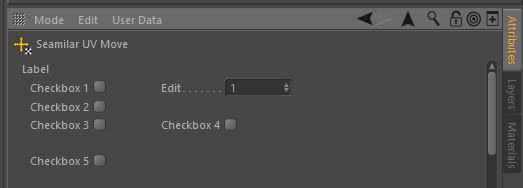
Statictext indentation
-
On 27/04/2018 at 00:29, xxxxxxxx wrote:
User Information:
Cinema 4D Version: R19
Platform: Windows ;
Language(s) : C++ ;---------
Hi,I am using a resource description which contains a text label as the heading of a group of gadgets, but I cannot seem to find a way to indent the statictext correctly, so it lines up with the rest of the gadgets.
CONTAINER Move_desc
{
  NAME Move_desc;

  GROUP
  {
      COLUMNS 1;

      GROUP
      {
          COLUMNS 3;

          STATICTEXT LABEL { ANIM OFF; }
          STATICTEXT {}
          STATICTEXT {}

          BOOL CHECKBOX1 { ANIM OFF; }
          REAL EDIT { ANIM OFF; UNIT REAL; MIN 1.0; MAX 100.0; }
          STATICTEXT {} // filler

          BOOL CHECKBOX2 { ANIM OFF; }
          STATICTEXT {} // filler
          STATICTEXT {} // filler

          BOOL CHECKBOX3 { ANIM OFF; }
          BOOL CHECKBOX4 { ANIM OFF; }
          STATICTEXT {} // filler

          SEPARATOR {}
          STATICTEXT {} // filler
          STATICTEXT {} // filler
      }
  }
}
The label always seems to be positioned too far to the left.
-
On 27/04/2018 at 06:04, xxxxxxxx wrote:
Hi,
the Attribute Manager (or parameter descriptions) is not really about custom layouts. Do you have any evidence static text is used and aligned this way anywhere else in Cinema. Then I could do some research.
Otherwise I'd recommend to stay with C4D's standard design language and use a group bar instead. -
On 28/04/2018 at 22:22, xxxxxxxx wrote:
Oh, I didn't mean to imply to requiring custom layout.
The checkboxes 1 to 4 contain identical words in their names, as such I thought to be clever (and eco-friendly) by only mentioning those words once, as a static text kind of "header".I didn't feel like using a group bar for this, as it would distract from the 5th checkbox. Which is on its own, but also would need to be seen as a group then. And for this single checkbox I surely didn't want to introduce a group bar.
As for the evidence of usage of static text elsewhere in Cinema 4D resulting in such ... sure, I did find some places where it's been used and resulting in the same strange unwanted indentation.
I understand the reason for this indentation (or the lack of), as it happens for buttons as well.I think it is due to the fact that all other gadgets have an animation control in front of them, moving the text slightly to the right.
Static text and buttons don't have an animation control and don't require extra space in front, and as a result are thus shifted to the left, relative to the text of the ones with animation control.For examples:
- set the Attribute Manager mode to "Project":
-- in the Project tab, the buttons are slightly shifted to the left in relative to the other entries
-- in the Info tab the middle gadgets from "File Format" to "Last Save Date" are all static text, and all are shifted to the left,
-- in the Dynamics tab, the top gadgets are buttons and static text, all shifted to the left, relative to the bottom gadgets, which all have animation controls.
- ...
- my most favorite one is the collider tag, as it exactly shows the same eco-friendly "header" I am trying to achieve ... namely the "Exclude Polys". It "groups" the buttons next to it, without it actually being a group or group bar.OK, reading back the above it sounds a little mockery, which wasn't the intention at all.
But when I see all these places where this unwanted (un)indentation of static text happens, I guess it makes no sense of trying to fight against it. The (un)indentation is there, and it's on purpose.
Well, maybe not "on purpose", but it's the intended behavior, I mean.This case can be closed, as there is no actual case.
Thanks for reading -
On 03/05/2018 at 01:40, xxxxxxxx wrote:
Hi,
no worries about mockery. You are right about this indentation inconsistency.